Vertical Web Design
Last updated

Every new medium mimics what came before.
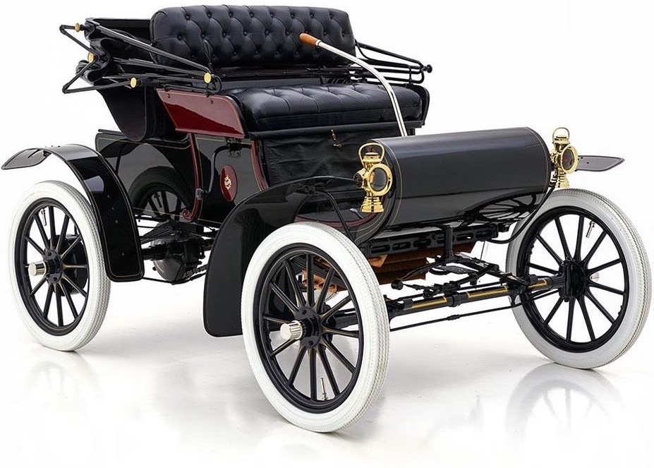
Early cars looked like motorised carriages, and early cinema was filmed like a stage play from the audience’s perspective—it took decades for early filmmakers to understand the power of editing, camera angles, lighting and more.
It takes time for a medium’s unique characteristics—the strengths & weaknesses that set it apart from its predecessors—to reveal themselves, but as our understanding of them grows we’re able to move on from what came before and communicate through the medium in deeper, more meaningful ways.
The web is still a young medium, and our approach to designing for it is still heavily influenced—and shackled—by what came before; print design in particular. Of all the practices and concepts we inherited from print design, there’s one in particular that I believe is massively holding us back from taking design on the web to the next level: columns.
It’s time to move on from column-based layouts.
Next: Reading momentum

