
Vertical Web Design
Last updated May 7, 2022
A young medium
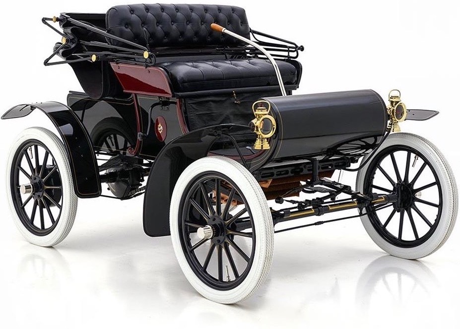
Every new medium mimics what came before.
Early cars looked like motorised carriages, and early cinema was filmed like a stage play from the audience’s perspective—it took decades for early filmmakers to understand the power of editing, camera angles, lighting and more.
It takes time for a medium’s unique characteristics—the strengths & weaknesses that set it apart from its predecessors—to reveal themselves, but as our understanding of them grows we’re able to move on from what came before and communicate through the medium in deeper, more meaningful ways.
The web is still a young medium, and our approach to designing for it is still heavily influenced—and shackled—by what came before; print design in particular. Of all the practices and concepts we inherited from print design, there’s one in particular that I believe is massively holding us back from taking design on the web to the next level: columns.
It’s time to move on from column-based layouts.
Reading momentum
In most western printed media (books, magazines, etc), the reading momentum is horizontal. A composition’s primary goal is usually to guide the reader’s eye from the top left of the layout to the bottom right—at which point they turn the page, bringing their eye back to the top left, ready to go again.
One of the most effective ways to do this is by laying the content out in columns. Vertical bars cause our eyes to instinctively scan across them horizontally, so column-based compositions tend to have a strong horizontal reading momentum.
However, on the web we’re scrolling through content vertically, not turning pages horizontally, so we need the reading momentum to be vertical, not horizontal. When we use a column-based composition on the web, it guides the reader’s eyes horizontally, just as in print… except this time when their eyes get to the right edge of the screen there’s nowhere to go. Since our compositions are fighting against the web’s natural reading momentum, we’ve had to resort to adding little ‘scroll down’ arrows to prevent readers getting confused.
To create compositions that have an in-built vertical reading momentum, we need to base them on horizontal bars (or, y’know, rows) that will guide the reader’s eye downwards.
I’m not saying columns are irrelevant in web design. Just as a baseline grid fills a strong supporting role in print, columns can still be used to great effect on the web, but they shouldn’t be our primary concern. When designing for the web (or any medium with a vertical reading momentum), the vertical grid should take the lead. The backbone of our compositions should be rows, not columns.
Vertical pacing
We can’t control the speed at which a reader scrolls through content, but we can control the pace.
Let’s try an experiment. Below is a single column of lines that tightens and loosens over and over, across many screens. Don’t worry about what it’s for — just scroll down through it at whatever pace feels natural, and try not to think about it.

Now, I can’t say for sure that you slowed as the lines spread apart and sped up as they tightened… but I bet you did. That’s an emotional reaction, and demonstrates the power that simple compositional choices can have: our layouts can do so much more than simply ‘fit the content’ onto the screen, or ‘make it look good’. When we embrace vertical pacing within our designs, we can use composition to connect with our readers on a much deeper, emotional level.
When we embrace vertical pacing within our designs, we can use composition to connect with our readers on a much deeper, emotional level.
The great thing about vertical pacing is that it’s relatively unaffected by screen size. If our primary concern when designing a composition is the vertical pacing of the content, then it shouldn’t matter whether it’s being expressed on a narrow mobile device or a 30″ monitor. While the exact composition can (and usually should) adapt to the canvas on which it’s being viewed, the vertical pacing—the emotional heartbeat of the composition—can still be maintained.
Film editors understand the power of pacing all too well: a common exercise in film schools is to have students watch a scene and ‘clap’ every time they spot a cut. A romantic scene might result in a soft, steady clap, whereas watching a Hitchcock thriller may start slow and get gradually faster as the tension mounts. A fight scene from Michael Bay’s Transformers films will make the classroom sound like a cheap fireworks display.
Watching a film is a passive experience, but scrolling through a website requires active participation from a reader. Whether they’re using a mouse or touching the content directly on their phone, they’re literally stroking their way through our content. That’s a far more intimate connection with our audience than film will ever have, and when we create compositions that dance to the rhythm the reader is setting, we can use that bond to leave a lasting emotional impression.
When we create compositions that dance to the rhythm the reader is setting, we can use that bond to leave a lasting emotional impression.
Every composition has a vertical pace, but if it’s not designed intentionally then it’s unlikely to be causing the reader to feel what we’d hope. What kind of emotional journeys do we want to take readers on when they scroll through our content? Do we want them to feel excited? Relaxed? Somber? While we can certainly affect these things through traditional design tools like colour and typography, I believe we could do it on a much deeper level through vertical pacing, if we try.
Patterns & transitions
Web layout has a lot of untapped potential, but if we’re to explore it (and ultimately master it) we first need to be able to talk about it. To do that, we’re going to need a better vocabulary.
Cinematography has such a well-established vocabulary that when I say “wide shot of deserted street, slow pan to cowboy, fade to closeup of cowboy’s eyes, cut to medium shot as he reaches for his holster”, you can probably imagine that exact scene—its pacing and emotion—without any visual reference.
Now, try and describe a web-based layout with words. The vocabulary we use to describe web layouts has been mostly borrowed from print, so while we can talk at length about “a sidebar in column 1 and text block spanning columns 2–4”, we’re ill-equipped to have any nuanced discussions about vertical pacing.
What do you call it when you have three images with captions side-by-side? How about when you have images on the left and text on the right… or when you have image on the left and text on the right, then text on the left and image on the right, and so on? We use these layout patterns all the time, yet their lack of widely-understood labels means I probably need to show you an image to be sure you understand what I mean, and talking about them is exhausting. Imagine if Spielberg had to say “ok at this point I want you to slowly rotate the camera horizontally, then gradually reduce the opacity of that shot while increasing the opacity of the shot where we changed the lens to a telephoto and aimed it at the actor’s face“? “Slow pan, then fade to closeup” is a lot quicker.
Once we have words to describe these patterns, we can have better conversations about the emotional impact they have on a reader, and when might be appropriate to use them.
How does the emotional impact differ between an image that takes up the entire screen, versus side-by-side images, versus ‘staggered’ images and text blocks? How does it feel when we scroll from one pattern to another? How does it feel when the background of one section is dark and the next is light? Or what about when the background fades between the two? What happens if I gradually reduce the vertical padding of each section, will the reader feel like things are speeding up? if I zig-zag the content in this section, then square it all off in the next, how will that make the reader feel?
These are the kind of discussions we need to be having if we’re going to explore the full potential of vertical web design.