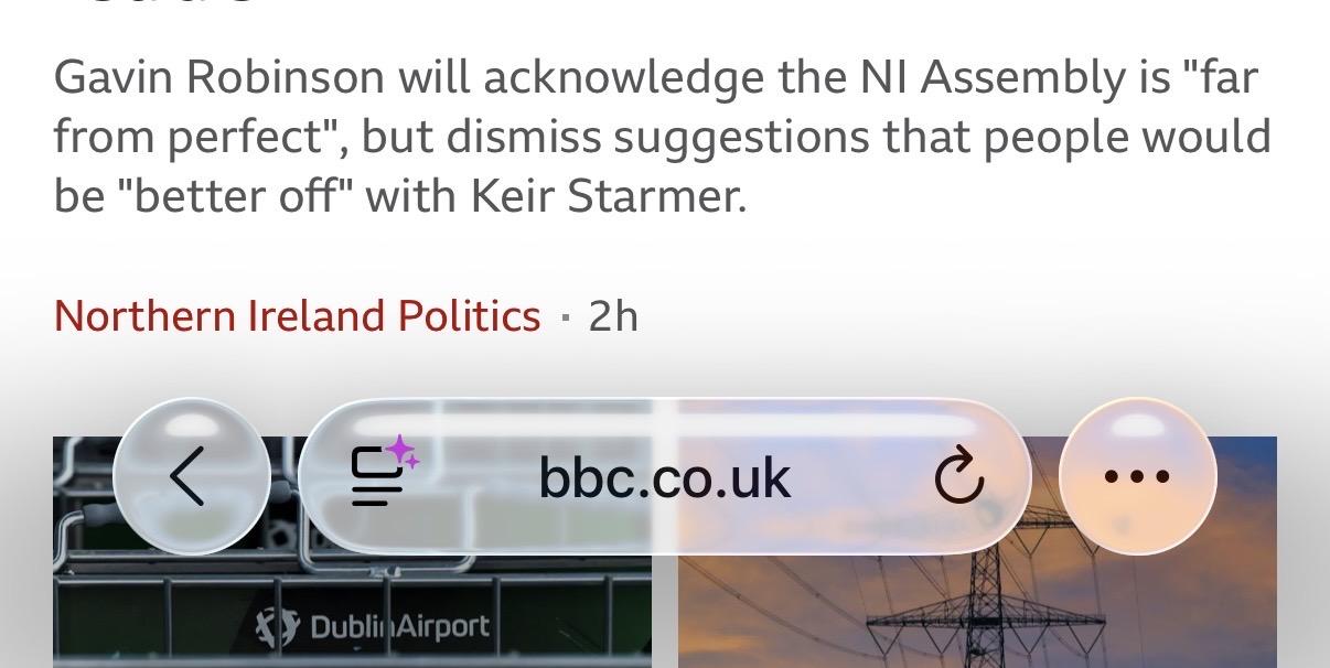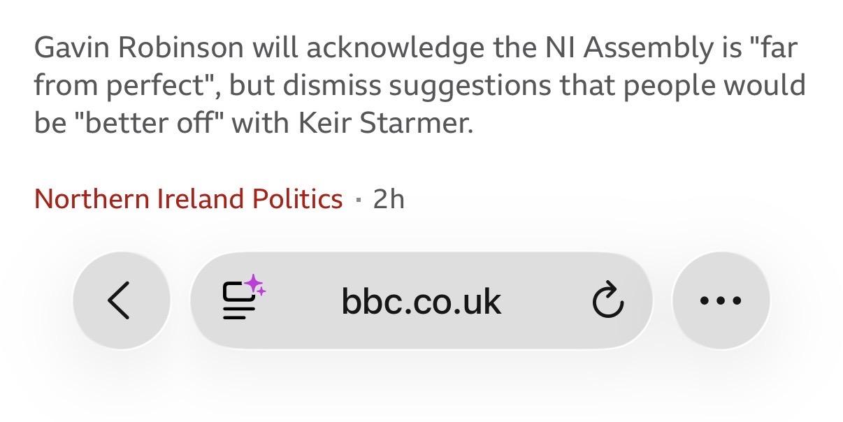
Ok I’ve been trying to reserve judgement on Liquid Glass until it was officially released. But now it is, and… it’s not good, is it?
It just feels really visually unpolished (ironically).
The type and spacing are all over the place (I count 4 different alignment axis)… and why on earth does that back button need contrast against a white background?
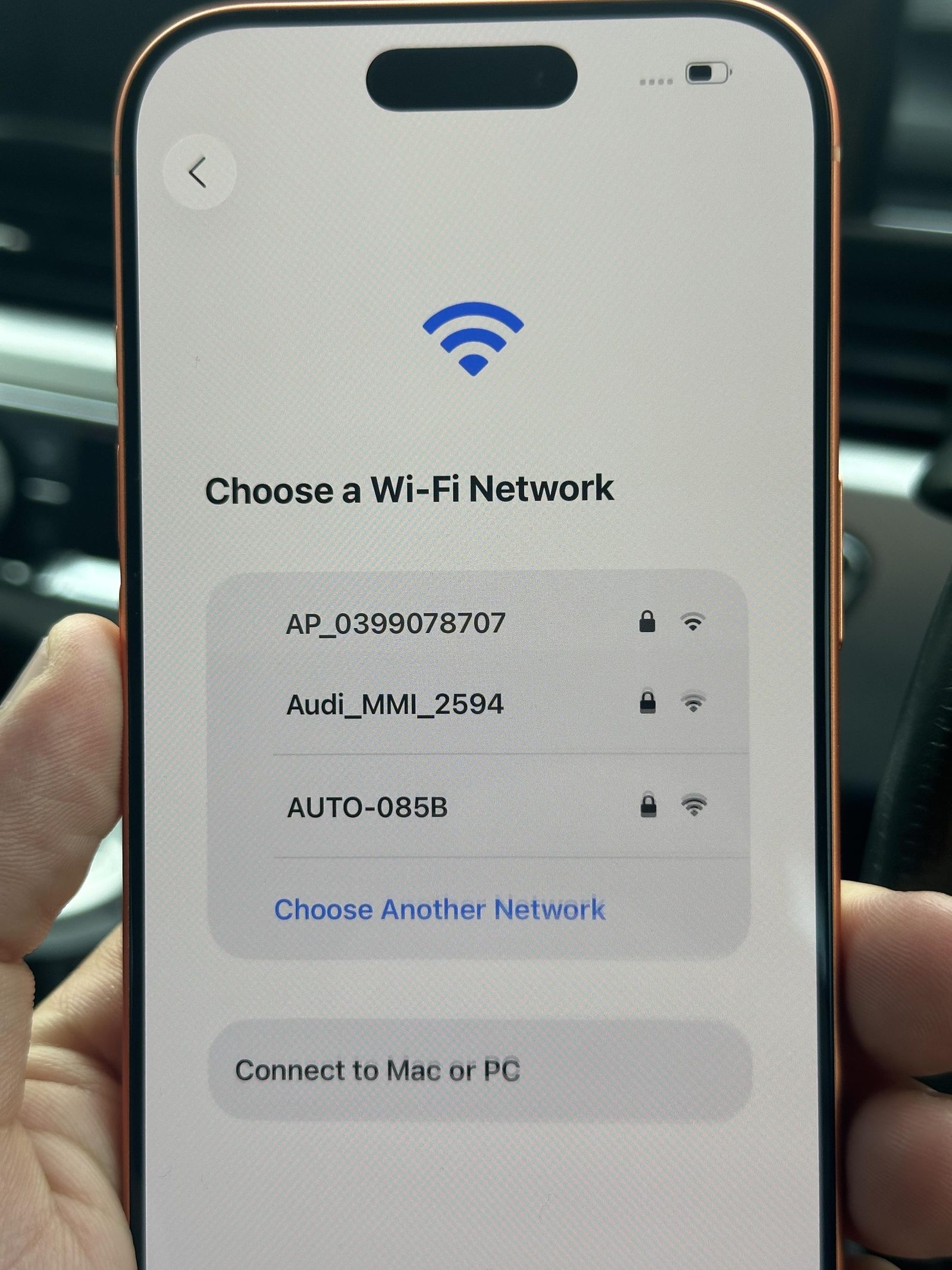
I hate this so much
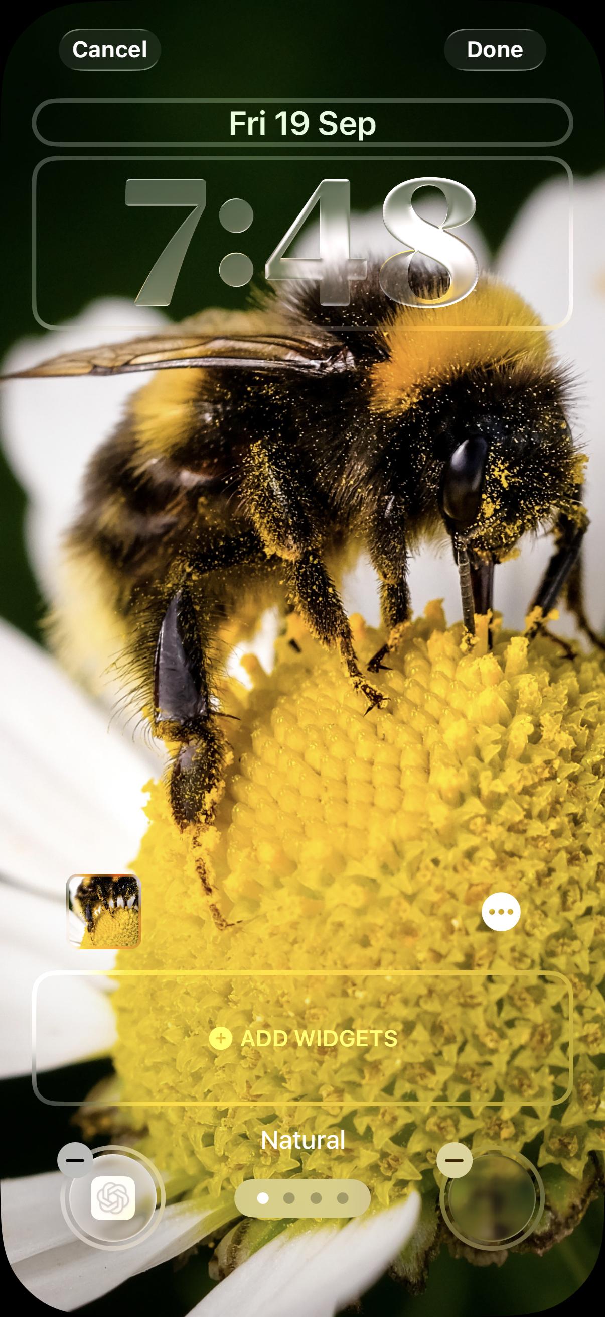
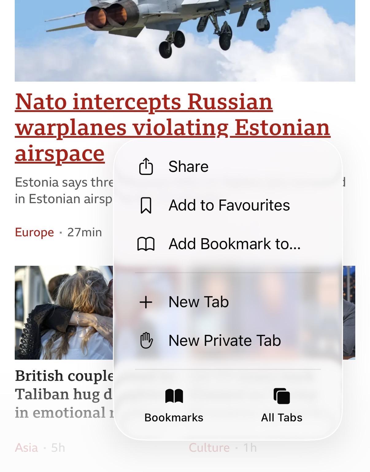
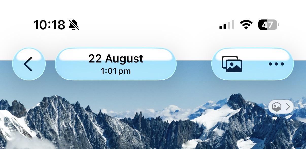
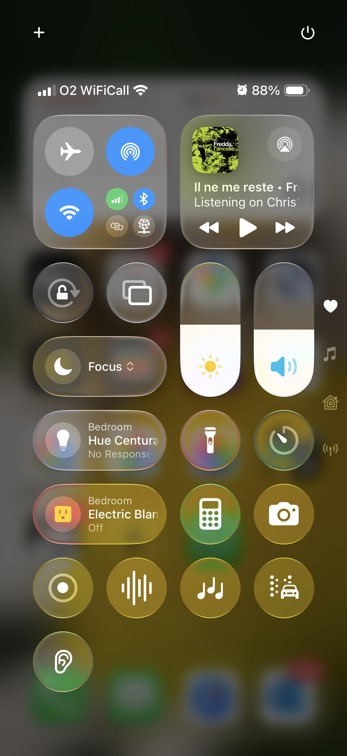
1 day in and I’ve turned on “reduce transparency” in accessibility settings. Some spacing issues remain but this is already so much better. Why would I want a URL bar to be drawing so much attention when I’m trying to browse a website?
The little purple dot in the “AI summary” icon was already too obnoxious for my liking, it’s putting Apple’s engagement metrics ahead of user needs.